
Histograms are an invaluable tool for understanding the distribution of data over a range. By presenting data as a collection of bars with varying heights, it is easy to get an initial sense of what the underlying data set looks like. Further analysis can then be performed to determine clustering and outliers more accurately. Fortunately, creating histograms based on spreadsheet data has been simplified by Google Sheets which allows you to quickly and easily generate a histogram in just a few clicks. The great thing about using Sheets is that once the histogram has been created, any subsequent updates in your data will automatically update your histogram too, allowing you to stay up-to-date with any changes. All you need is a single data set and you’ll be ready to start visualizing the distribution of your data.
How To Make A Histogram In Google Sheets?
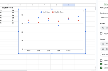
It only takes a few clicks to create a bar chart with basic settings. If there are more specific tasks, then it will be necessary to make additional changes to its representation, but more on that later.
How to make a histogram in Google Sheets:
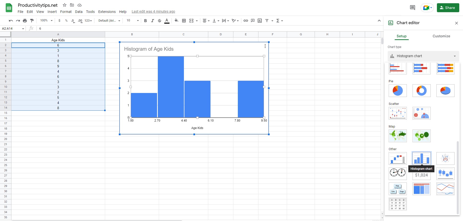
- We select a set of values based on which the histogram will be built.
- Open the “Insert” tab and click on the “Chart” option.
- Change the graph type to a bar chart. It may be enabled by default, but in other cases, additional configuration is required. To do this, click on the 3 dots in the upper right corner of the chart, and select “Edit Chart”. In the “Chart Type” section, scroll down to the “Histogram chart” item.
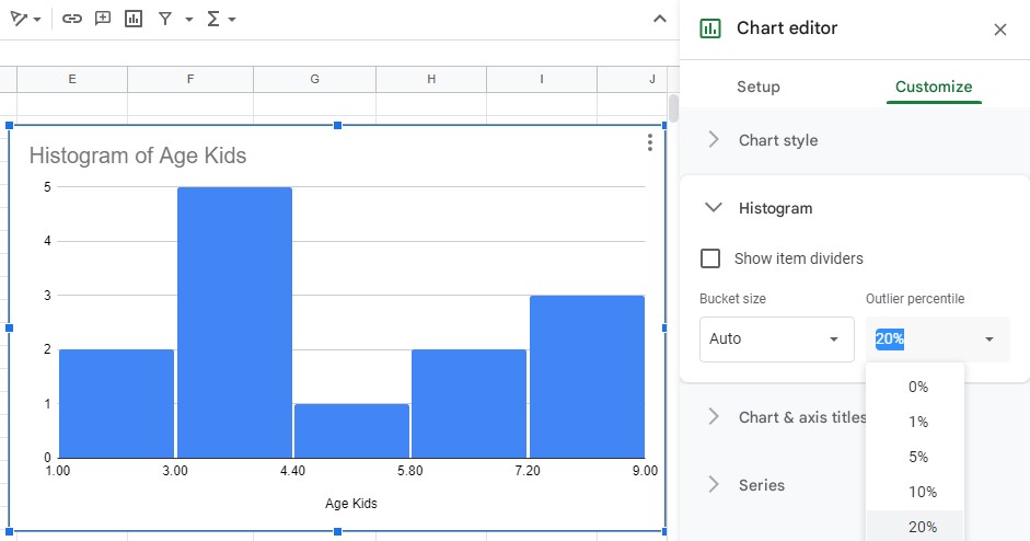
If desired, the user can replace various histogram parameters in the settings. Including titles, series, legends, axis, gridlines, and more. The options in this menu speak for themselves, so there is no point in describing everything in detail.
In conclusion, creating a histogram in Google Sheets is an easy and effective way of visualizing data to understand the underlying distribution. By following these simple steps, you will be well on your way to creating a beautiful and informative representation of your data set in just 1 minute.