Pie charts are a popular and effective way to visually represent data proportions in a circular format. Google Sheets offers a user-friendly interface that allows you to create compelling pie charts to convey information in a clear and concise manner. In this article, we will walk you through the steps of making a pie chart in Google Sheets, complete with easy-to-follow examples.
Preparing Data for the Pie Chart
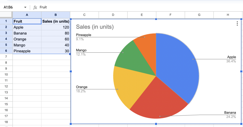
Before creating a pie chart, you need to have data that represents the proportions you want to visualize. For this example, let’s say we have the following data:
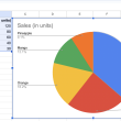
Example 1: Fruit Sales Data
| Fruit | Sales (in units) |
|---|---|
| Apple | 120 |
| Banana | 80 |
| Orange | 60 |
| Mango | 40 |
| Pineapple | 30 |
Creating the Pie Chart
Now that we have the data ready, follow these steps to create a pie chart in Google Sheets:
Example 2: Making a Basic Pie Chart
Step 1: Select the data range you want to include in the chart (including both the labels and values).
Step 2: Click on the “Insert” tab in the Google Sheets menu.
Step 3: Click on “Chart” from the drop-down menu.
Step 4: In the Chart Editor, navigate to the “Chart type” tab.
Step 5: Select “Pie chart” from the available chart types.
Step 6: You should now see a basic pie chart representing the data.
Customizing the Pie Chart
Google Sheets allows you to customize the appearance and style of your pie chart to make it more visually appealing and informative.
Example 3: Customizing the Pie Chart
Step 1: With the pie chart selected, click on the three dots in the upper right corner of the chart to open the Chart Editor.
Step 2: In the Chart Editor, navigate to the “Customize” tab.
Step 3: Here, you can modify various elements of the chart, such as the chart title, colors, labels, and more.
Step 4: To add data labels to the slices, click on “Data labels” and select your preferred option (e.g., “Percentages”).
Step 5: Play around with the customization options until you are satisfied with the chart’s appearance.
Moving the Pie Chart
By default, Google Sheets places the chart in the center of the sheet. However, you can move the chart to a specific location within the sheet.
Example 4: Moving the Pie Chart
Step 1: Click on the pie chart to select it.
Step 2: Click and drag the chart to the desired location within the sheet.
Resizing the Pie Chart
You can adjust the size of the pie chart to fit your needs and the available space in the sheet.
Example 5: Resizing the Pie Chart
Step 1: Click on the pie chart to select it.
Step 2: Click and drag any of the corner handles to resize the chart as desired.
Conclusion
Creating a pie chart in Google Sheets is a straightforward process that can effectively showcase data proportions in a visually appealing manner. By following the steps outlined in this article and experimenting with the customization options, you can create informative and engaging pie charts to enhance your data presentations. So, go ahead and give it a try with your own datasets in Google Sheets!