In some cases, you might want to create a dot plot with multiple data series to compare different sets of data on the same axis. Google Sheets allows you to achieve this by following these steps:
Step 1: Entering the Data
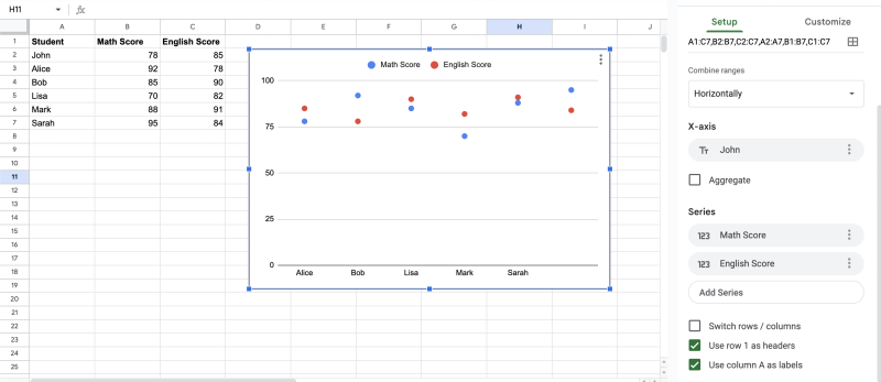
Let’s assume we have two sets of exam scores for two different subjects: Math and English.
| Student | Math Score | English Score |
|---|---|---|
| John | 78 | 85 |
| Alice | 92 | 78 |
| Bob | 85 | 90 |
| Lisa | 70 | 82 |
| Mark | 88 | 91 |
| Sarah | 95 | 84 |
Step 2: Sorting Data
Similar to the previous example, sort the data based on either Math or English scores in ascending or descending order.
Step 3: Inserting the Dot Plot with Multiple Data Series
- Select the cell where you want the dot plot to start. Let’s say we’ll start at cell A10.
- Click on “Insert” in the top menu and then choose “Chart” from the drop-down menu.
- In the Chart Editor, select “Chart type” as “Scatter.”
- Check the box next to “Use column A as labels.”
- In the “Chart data” section, click on “Add Series.”
- For “X-axis,” select the range containing student names (A2:A7).
- For “Y-axis,” select the range containing Math scores (B2:B7).
- Click on “Add another range” to add the second data series.
- For “X-axis,” again select the range containing student names (A2:A7).
- For “Y-axis,” select the range containing English scores (C2:C7).
- Customize the chart title and axis titles for clarity.
Step 4: Adjusting Dot Size and Series Color (Optional)
You can customize the dot size and color for each series to make the chart more visually appealing and easier to interpret.
- In the Chart Editor, click on “Customize” (the paintbrush icon).
- To adjust the dot size, scroll down to “Series,” and use the “Point Size” slider.
- To change the color of each series, go to “Chart style” and click on the color options.
Step 5: Finalizing the Dot Plot with Multiple Data Series
Once you’ve made the desired adjustments, click on “Insert” to add the dot plot with multiple data series to your Google Sheet.
With these examples, you now have a clear guide on how to create a simple dot plot and a dot plot with multiple data series in Google Sheets. Use this powerful visualization tool to gain valuable insights from your data and make more informed decisions.